From Pantry To Palette: Food-Themed Color Trends Dominating 2025
Colors have always drawn inspiration from the world around us, and in 2025, our kitchen pantries are leading the way in design. Food-inspired hues are making a splash across fashion, home decor, and graphic design this year.
These mouthwatering shades bring warmth, comfort, and a touch of culinary charm to spaces that crave personality.
1. Matcha Green Takes Center Stage
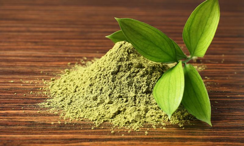
The earthy, powdery green of matcha tea has transcended the cup to become 2025’s most coveted color. Interior designers are using this calming shade for accent walls and furniture pieces.
Fashion houses have embraced matcha for everything from casual wear to runway statements. The color’s versatility makes it perfect for both minimalist and maximalist aesthetics.
2. Saffron Gold Gleams
Borrowed from the world’s most expensive spice, saffron gold radiates luxury and warmth. This rich amber-yellow tone appears in textiles and metallic finishes throughout high-end homes.
Jewelry designers particularly love this hue for its association with prosperity and joy. When paired with deep blues or purples, saffron gold creates a regal combination that elevates any space.
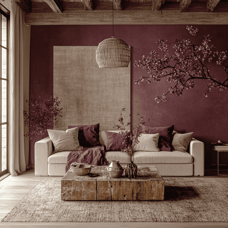
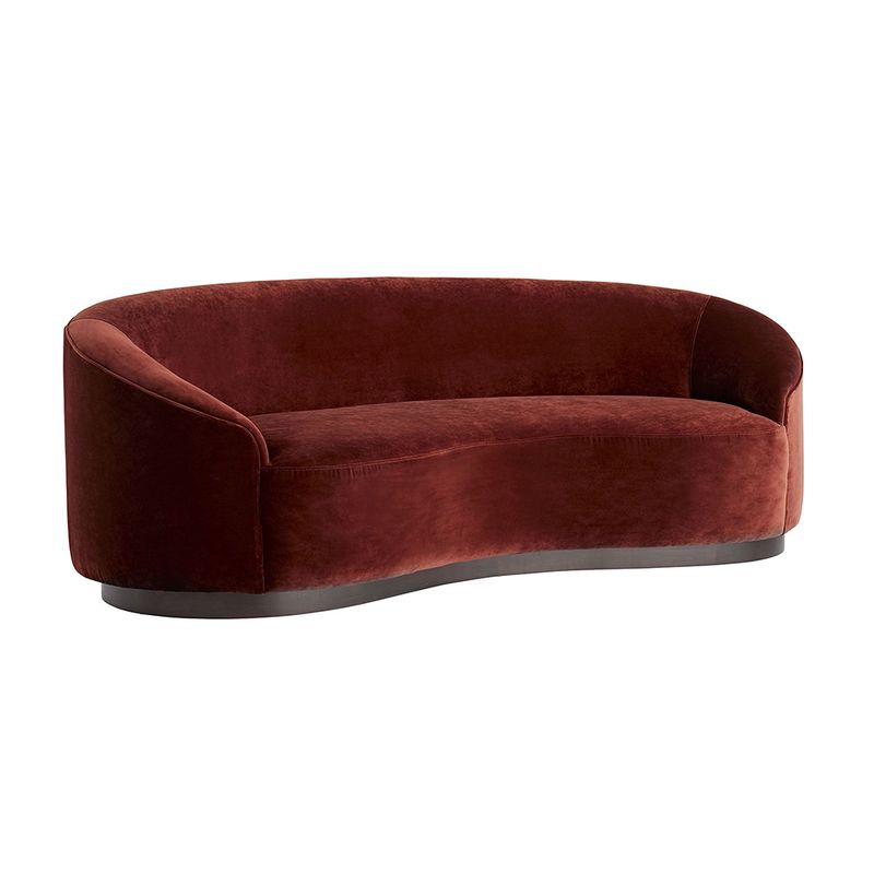
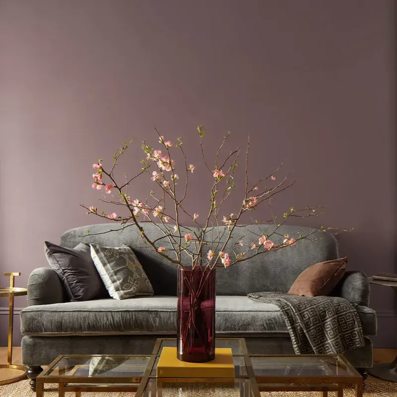
3. Blackberry Purple Deepens Spaces
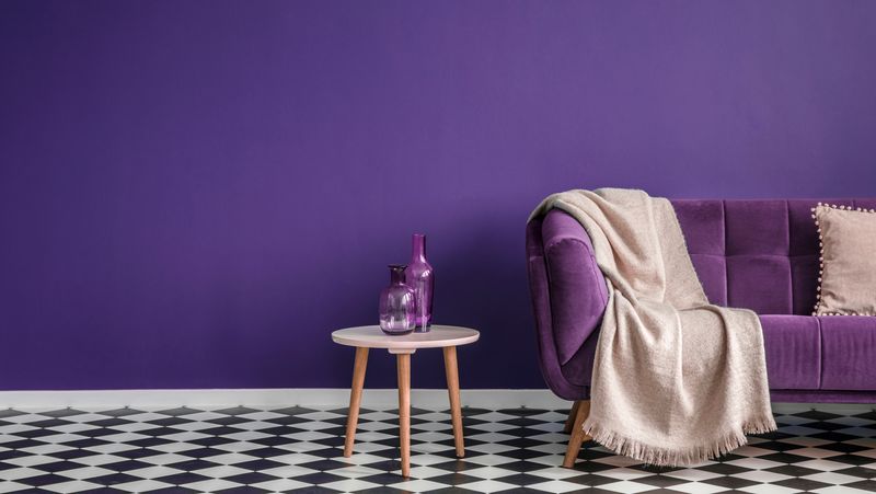
Remember picking wild blackberries as a kid? That deep, mysterious purple has become the dramatic shade of choice for those seeking depth in their spaces.
Furniture in blackberry tones stands out against neutral backgrounds while creating a sense of sophistication. This color works wonderfully in velvet textures where it can show off its dimensional quality.
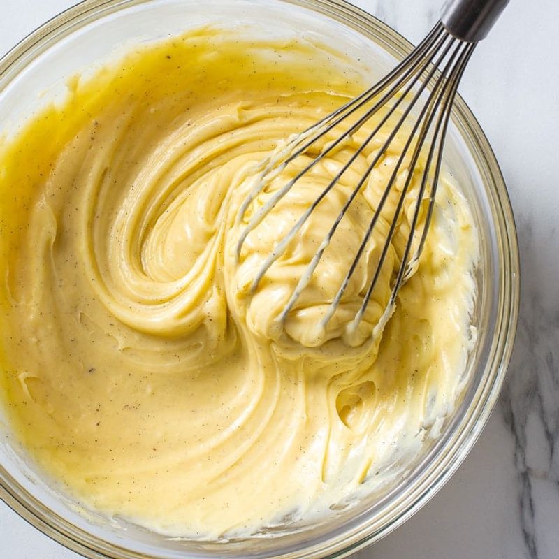
4. Butter Yellow Softens
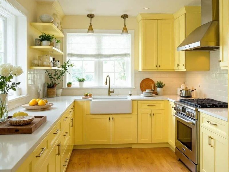
Gentle without being babyish, butter yellow brings subtle warmth to any space. This creamy, soft yellow works beautifully in kitchens and breakfast nooks where morning light enhances its glow.
Painters love how this shade creates an instant feeling of cheerfulness without overwhelming the senses. Unlike harsh primary yellows, butter yellow plays well with almost any color palette.
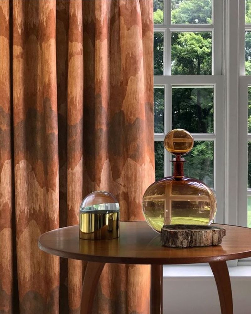
5. Cinnamon Spice Warms Everything
Cinnamon spice isn’t just for your latte anymore! This warm, earthy reddish-brown has become the go-to neutral for those tired of gray and beige.
Architects are incorporating this color through natural materials like terracotta and clay. The spice-market inspired shade creates instant coziness, making it perfect for living spaces where comfort is key.
6. Blueberry Burst Refreshes
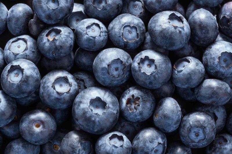
Vibrant yet sophisticated, blueberry burst captures the perfect balance between playful and refined. This saturated blue-purple appears in everything from bathroom tiles to statement furniture pieces.
Graphic designers have adopted this shade for logos and branding that need to convey creativity and trustworthiness simultaneously. The color’s natural origins make it feel both familiar and fresh.
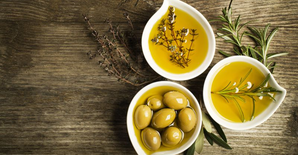
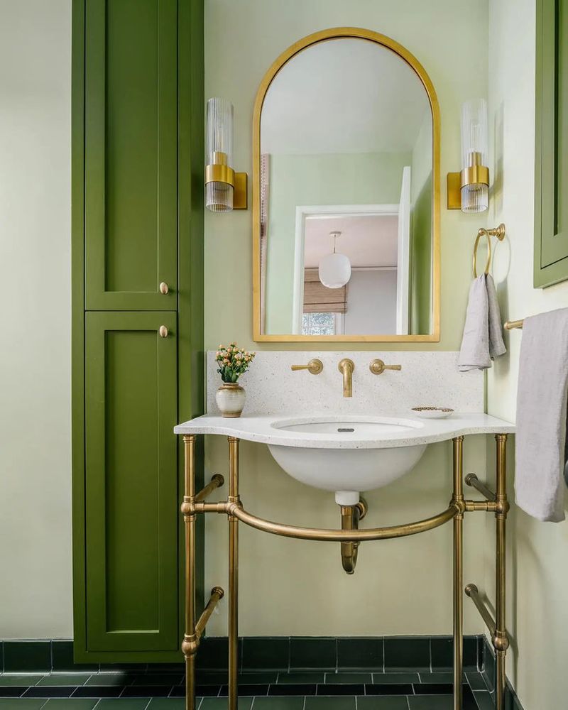
7. Olive Oil Brings Subtle Luxury
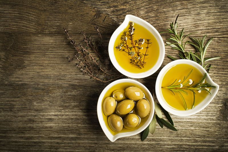
Move over, emerald green! Olive oil’s sophisticated yellow-green has become the understated luxury tone of choice for 2025. High-end brands are using this shade for packaging and identity systems.
Fashion labels feature olive oil tones in sustainable collections, highlighting its natural associations. The color’s subtlety makes it perfect for large furniture pieces that need to make a statement.
8. Paprika Red Spices Things Up
Paprika red offers the perfect alternative to traditional reds—slightly muted yet still vibrant with earthy undertones. This spice-inspired hue appears in textiles and painted accent pieces across contemporary homes.
Car manufacturers have even embraced this shade for special edition models. Unlike primary red, paprika feels sophisticated rather than aggressive.
9. Honeycomb Amber Glows
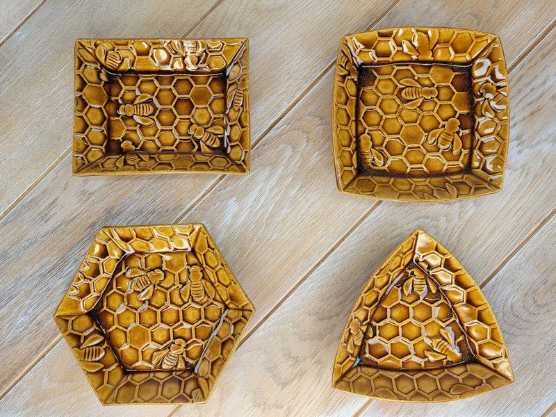
Capturing the translucent quality of fresh honey, this amber tone creates instant warmth in any application. Lighting designers particularly love honeycomb amber for fixtures that cast a golden glow.
Glass artists incorporate this hue in vases and decorative objects that catch and transform light. When used in textiles, honeycomb amber creates a sun-kissed effect that brightens spaces year-round.
10. Wasabi Green Energizes
Just like its culinary counterpart, wasabi green delivers an unexpected punch to design schemes! This vibrant yellow-green appears in small doses as an energizing accent color in contemporary spaces.
Furniture designers use wasabi green for statement pieces that need to command attention. The color’s intensity makes it perfect for small accessories that can be easily swapped as trends evolve.
11. Caramel Drizzle Comforts
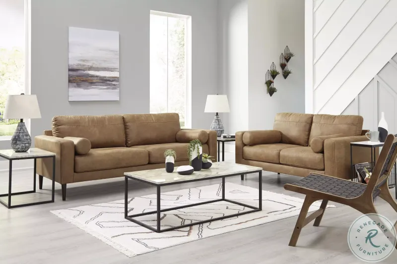
Reminiscent of your favorite dessert topping, caramel drizzle brings sweet sophistication to interiors. This golden-brown tone works beautifully in leather furnishings and wooden elements.
Architects incorporate this warm neutral through natural materials that age gracefully over time. Caramel’s versatility allows it to serve as either a main color or complementary accent in nearly any design scheme.
12. Pomegranate Jewel Enriches
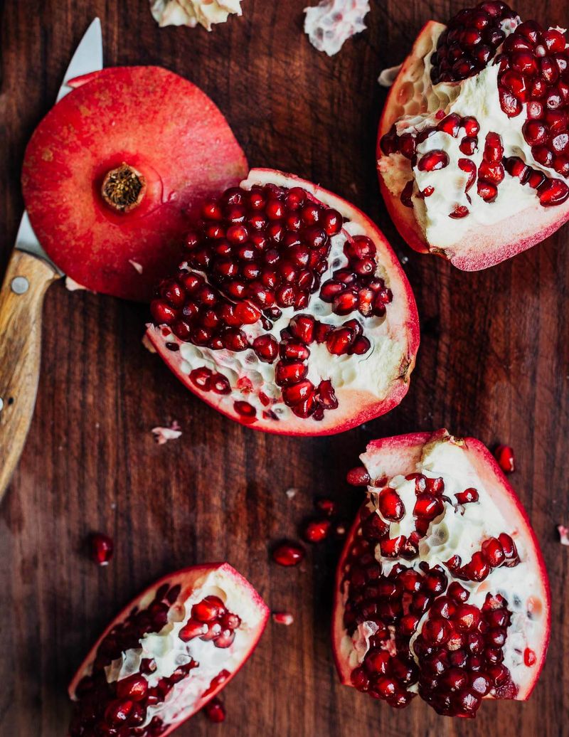
Luxurious and complex, pomegranate jewel captures the multifaceted color of the fruit’s seeds. This rich red with subtle purple undertones adds depth to fashion and interiors alike.
Jewelry designers draw inspiration from this shade for collections featuring garnets and rubies. The color’s natural elegance makes it perfect for formal spaces like dining rooms where it creates a sense of occasion.
13. Pistachio Cream Soothes
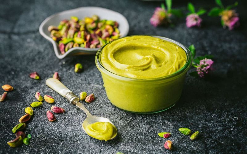
Soft yet distinctive, pistachio cream offers a fresh alternative to mint green with more warmth and sophistication. This pale green with subtle yellow undertones creates serene bedrooms and bathrooms.
Fashion has embraced pistachio cream for spring collections that feel fresh yet grounded. The color pairs beautifully with both warm and cool tones, making it an exceptionally versatile choice.
14. Espresso Intensity Grounds
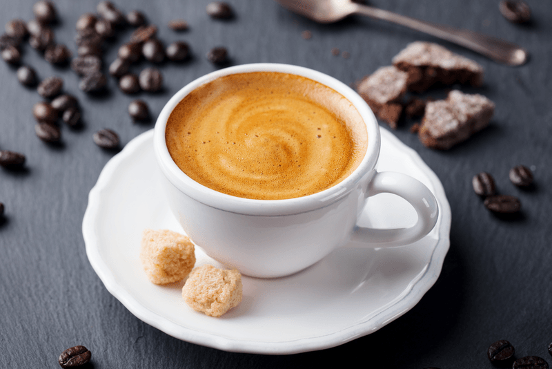
Dark, rich, and complex, espresso brings depth and grounding to spaces dominated by lighter tones. This nearly-black brown works beautifully in architectural details and furniture pieces.
Minimalist designers appreciate espresso’s ability to create definition without harshness. Unlike true black, espresso contains subtle warmth that makes spaces feel inviting rather than stark or severe.
15. Beet Root Adds Drama
Bold without being garish, beetroot brings sophisticated drama to any design. This deep magenta-purple works wonderfully in textiles where its richness can be fully appreciated.
Fashion designers use beetroot for statement pieces that command attention. When paired with neutrals, this food-inspired hue creates striking contrast that draws the eye without overwhelming a space.
16. Sage Infusion Calms
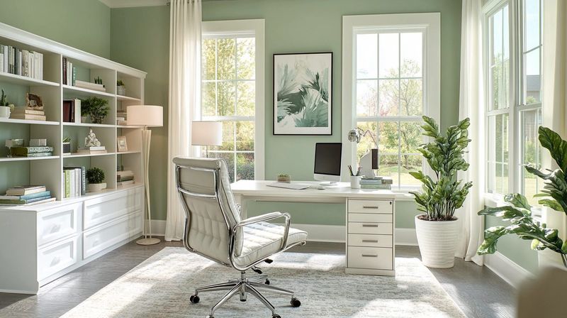
Herbal and soothing, sage infusion offers a sophisticated take on green that feels both timeless and current. This muted, gray-green creates peaceful bedrooms and contemplative office spaces.
Wellness brands have adopted sage for its associations with healing and tranquility. The color’s subtle nature makes it an excellent whole-room choice that won’t feel overwhelming even in small spaces.
17. Vanilla Cream Lightens
Far from boring, vanilla cream brings sophisticated brightness to spaces needing airiness. This warm off-white works beautifully as a base color that allows other elements to shine.
Designers appreciate vanilla cream for its ability to reflect light without the harshness of pure white. The subtle warmth makes spaces feel welcoming while maintaining a clean, contemporary aesthetic.