15 Food Logos With Sneaky Hidden Messages
Food logos are everywhere we look, but how often do we really stop to think about what they might be trying to tell us? These logos are not just visually appealing; they ingeniously convey hidden messages that reflect the brand’s values, history, or creativity.
Today, we’re uncovering the secrets behind 15 food logos that cleverly incorporate sneaky hidden messages. Once you see them, you’ll never look at these logos the same way again!
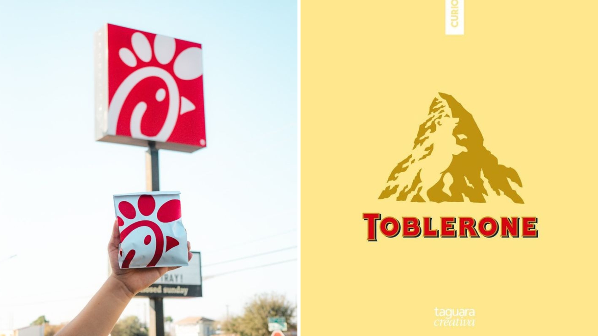
1. Chick-fil-A
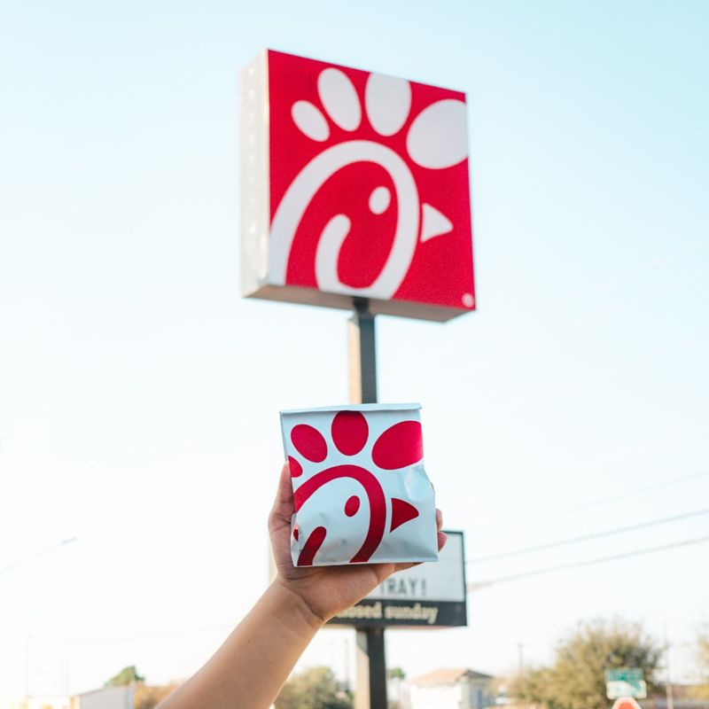
Chick-fil-A’s logo is more than just a name; it’s a clever design that forms a chicken head using the letters C, h, i, c, k. Perhaps you’ve never noticed this playful detail, but it perfectly captures the essence of their chicken-centric menu.
If creativity in branding appeals to you, then Chick-fil-A’s logo is a prime example. Not only does it stand out, but it also subtly reinforces their commitment to quality chicken products.
2. Heinz
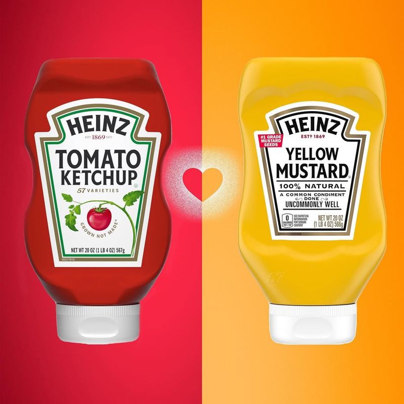
Heinz’s logo, featuring a keystone shape, might initially appear as a simple design element. However, it actually symbolizes Pennsylvania, the ‘Keystone State,’ where the company originated. This clever nod to its roots reinforces Heinz’s longstanding tradition and commitment to quality.
What a clever way to weave local pride into a global brand’s logo! Every ketchup lover is sure to appreciate this subtle nod to its roots and authenticity.
3. Orbit
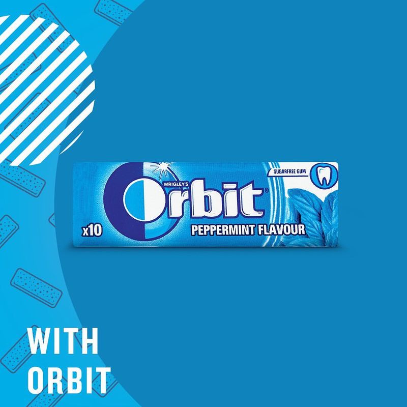
Orbit’s logo includes a planet with orbiting rings, cleverly representing their promise of freshness that feels out-of-this-world. If you’ve ever savored their gum, this cosmic design resonates with the refreshing burst of flavor offered in every piece.
Through this imaginative visual, Orbit communicates an adventurous spirit and a commitment to keeping mouths fresh. Such creative branding truly leaves a lasting impression.
4. Twix
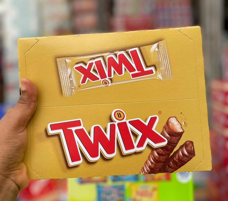
Twix employs parallel bars in its logo design, subtly hinting at the twin bars packed inside each wrapper. Though it might seem a simple visual choice, this design emphasizes the core concept of Twix: two bars, one package.
Twix’s logo is a brilliant nod to its name, reinforcing brand recognition with ease. This simple yet effective design perfectly captures the essence of this iconic treat—a true sweet success!
5. Hershey’s Kisses
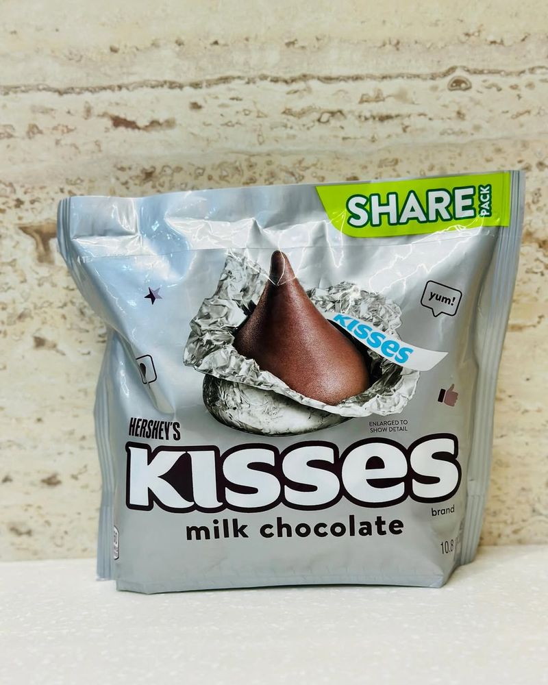
Hershey’s Kisses logo includes an ingenious hidden feature: notice the space between the K and I? There’s a kiss shape tucked away, echoing the sweet treat’s iconic form. It’s a subtle but powerful nod to their signature product.
How delightful to find such a playful element in a logo! Hershey’s Kisses demonstrates how attention to detail can enhance a brand’s visual identity and connect with consumers.
6. Tostitos
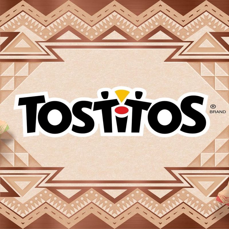
Tostitos’ logo hides a festive secret with two people sharing a tortilla chip and salsa. If you look closely, the two T’s form the people while the dot of the I serves as the bowl.
This joyful image captures the social and fun aspect of snacking. What a creative way to symbolize sharing and togetherness! Tostitos cleverly uses their logo to evoke the pleasure of communal dining.
7. Subway
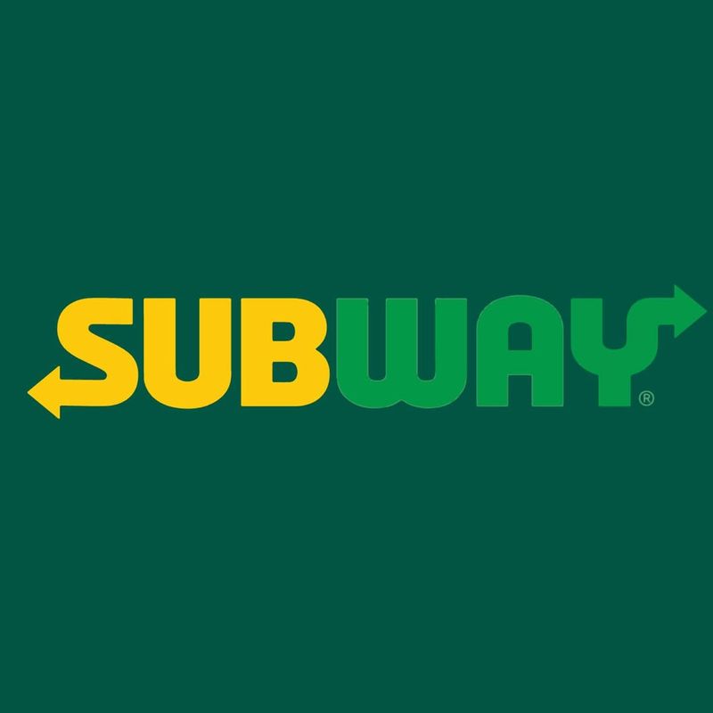
Subway’s logo incorporates arrows at the start and end of the word, subtly illustrating movement and choice. This design speaks to the brand’s promise of fresh, made-to-order sandwiches.
Such clever symbolism enhances the brand’s commitment to healthy eating and customization. When you think of fresh, personalized meals, Subway’s logo instantly comes to mind. Their design captures the essence of culinary freedom.
8. Burger King
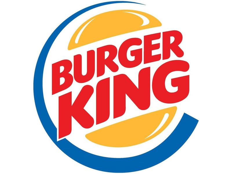
Burger King’s logo encircles its name with bun halves, mimicking the look of their famous Whopper. If you crave a burger, this fun and inviting design certainly catches the eye. The simplicity of this visual echoes the brand’s playful and approachable identity.
Burger King masterfully blends imagery and text to create an irresistible visual feast! Their logo is just as iconic and crave-worthy as their burgers.
9. Toblerone
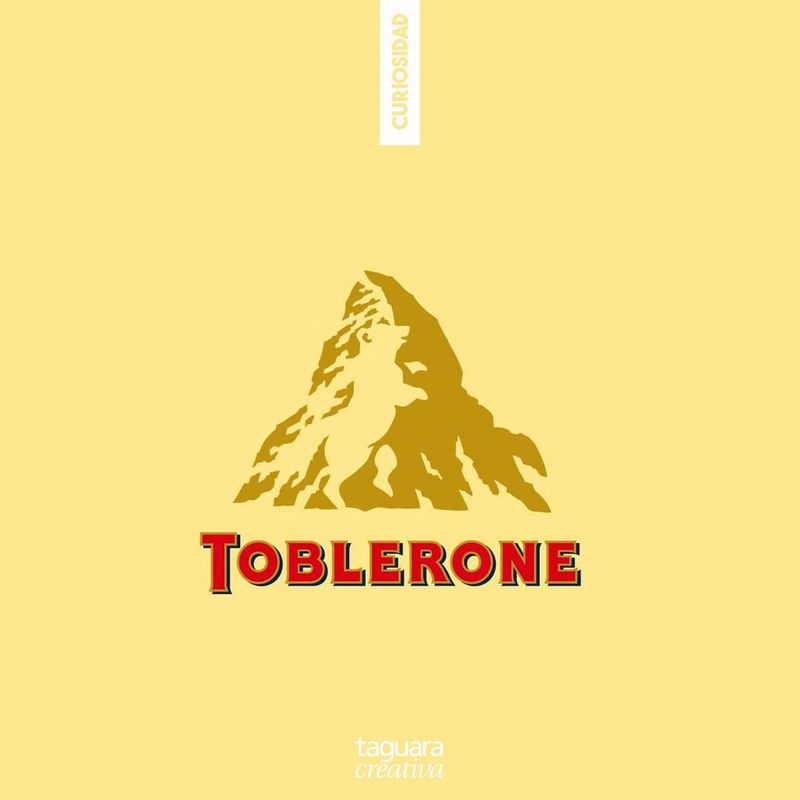
Toblerone’s logo is a showcase of clever design, with a hidden bear in the mountain image, symbolizing its Swiss roots. The bear represents the city of Bern, where Toblerone is made.
Such intricate detail not only highlights its origin but also the uniqueness of its product. If you enjoy rich, storied brands, Toblerone’s logo certainly offers a tale worth exploring. A brand that wears its heritage with pride!
10. Baskin Robbins
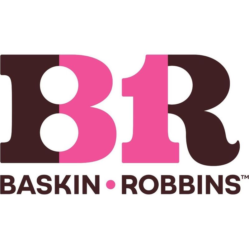
Baskin Robbins creatively places the number 31 within the initials B and R, symbolizing their commitment to offering 31 flavors. This playful design invites customers to explore a world of endless ice cream possibilities.
Blending creativity with creaminess, Baskin-Robbins’ logo is a brilliant tribute to its innovative spirit. Spotting its hidden number is as delightful as the treats themselves—a feast for both the eyes and the taste buds!
11. Wendy’s
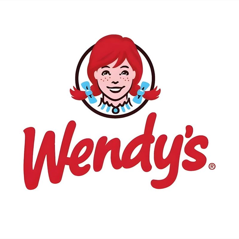
Wendy’s logo includes a subtle message with the word ‘mom’ hidden in the collar of the character. This touch reflects the brand’s family-oriented values and personal touch. If you value warmth and familiarity in dining, Wendy’s logo offers a comforting visual experience.
It’s a reminder that Wendy’s is not just about food; it’s about family. Such thoughtful branding creates an emotional connection with customers.
12. Lay’s
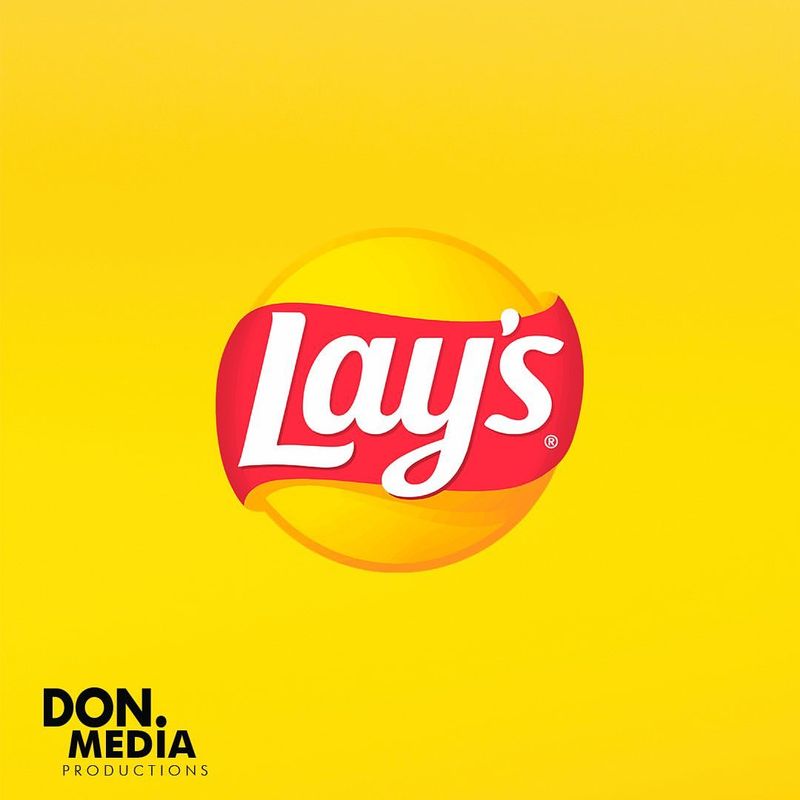
Lay’s logo features a brilliant hidden smile within the chip and wave design, representing happiness in every bite. If you savor the joy of snacking, this cheerful logo perfectly captures that sentiment.
Lay’s masterfully captures satisfaction and joy through its design! Their branding not only tempts you to grab a bag of chips but also leaves you smiling—simple yet powerful.
13. Duncan Hines
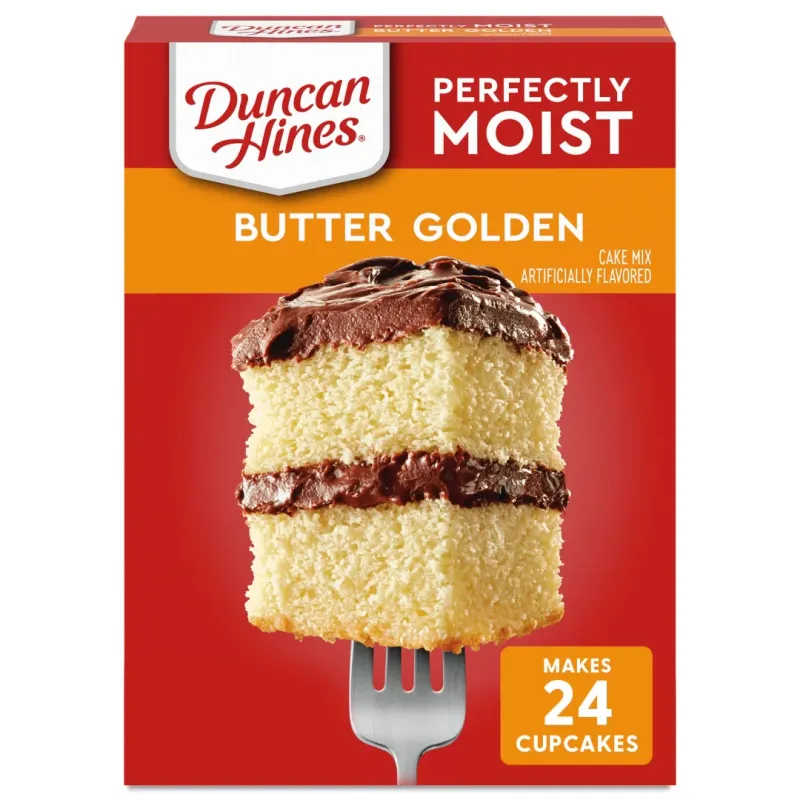
Duncan Hines cleverly incorporates a cake slice shape in its logo, emphasizing celebration and quality in baking. How fitting for a brand that has long been synonymous with delicious baked goods!
If baking is your passion, Duncan Hines’ logo surely resonates with its promise of excellence. This design not only highlights the brand’s core product but also its dedication to bringing joy to every kitchen.
14. Nestle
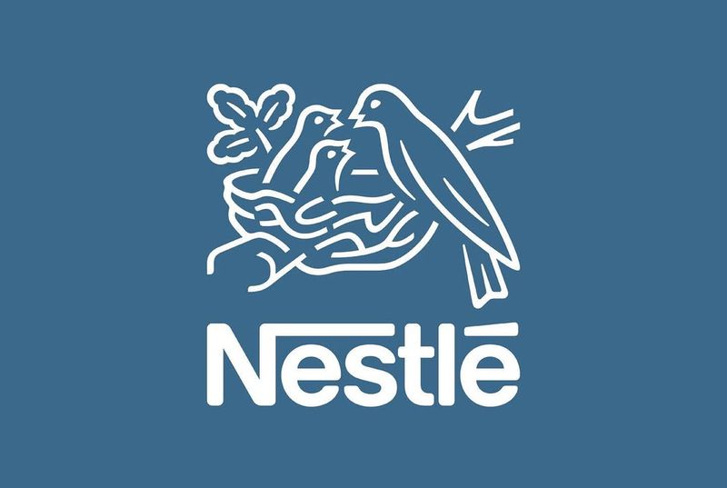
Nestle’s logo, featuring a bird’s nest, embodies care and nourishment. This iconic image reflects the brand’s commitment to nurturing families worldwide. If you appreciate brands with a rich history, Nestle’s logo tells a story of dedication and quality.
What a brilliant way to capture the heart of the brand’s mission! Nestlé’s logo serves as a lasting symbol of the care and dedication behind every product.
15. Milky Way
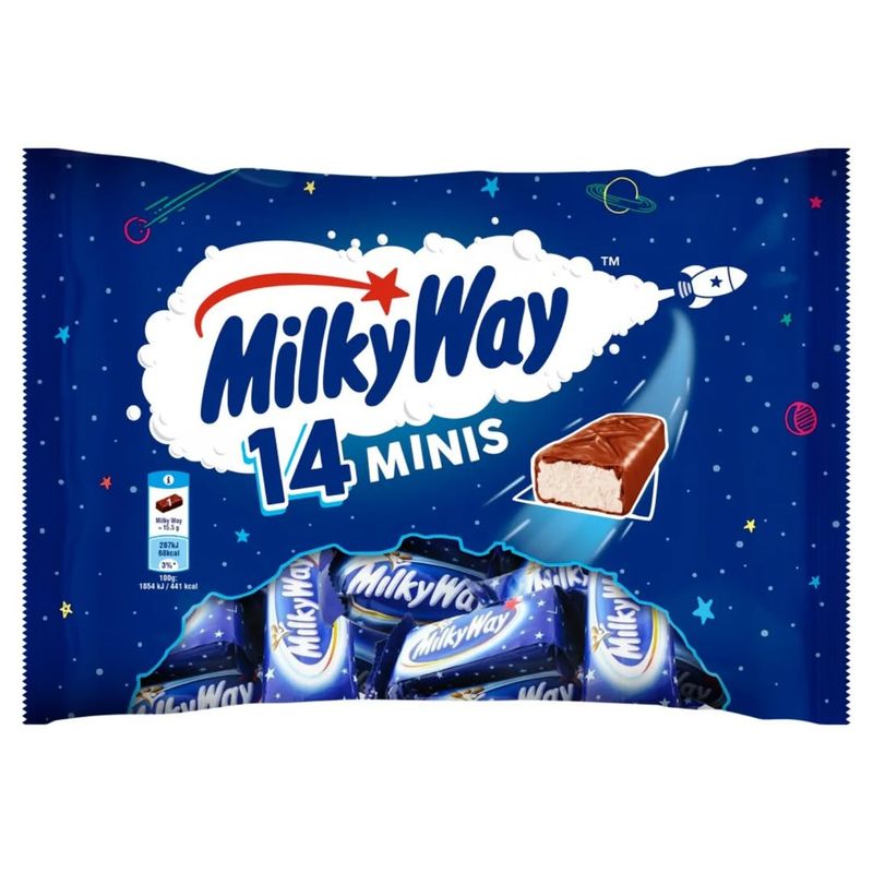
Milky Way’s logo transports you to a cosmic realm with its celestial theme. This design captures the sweet, out-of-this-world experience that their candy bars promise. If you’ve ever indulged in a Milky Way, this logo’s celestial imagery surely resonates with that delightful taste.
How perfectly it aligns with the brand’s promise of otherworldly sweetness! A visual treat for those who look beyond the ordinary.